
Data is a many splendored thing.
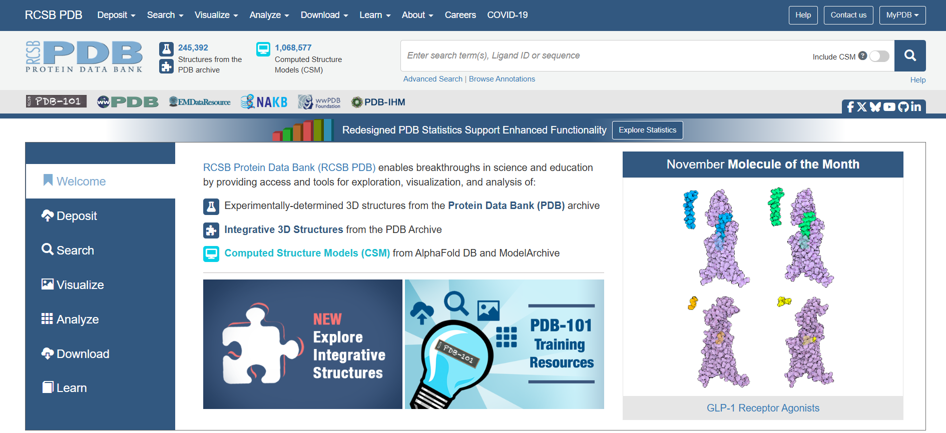
The RCSB Protein Data Bank (PDB) is an open access data center that archives information and 3D models of protein structures for both research and education purposes. Their user base is highly varied in both education and needs. In a partnership with the Rutgers Master of Business and Science program, PDB wanted to explore what changes might be helpful to their users to make PDB more usable.
Overview
Basics
5 UX researchers
10 weeks
Primary roles:
Creation of interview questions
Facilitation of interviews
Recruitment of participants not provided by the client
Analysis of test results and interview questions
Methods
User interviews
Contextual inquiry
Heuristic evaluation
Think aloud interviews
First click testing
Pen and paper prototyping
Wireframe prototyping
One on one user testing of prototypes
Problem
How can we refine PDB in order to make it more usable for a broad audience?
Discovery
We met with the PDB team to discuss what they thought their needs for the project were. They expressed a primary interest in refining the detailed summary pages for individual molecules. These pages contain things like 3D models, classification information, links to literature about that molecule, associated macromolecules and small molecules, experimental data and validation, and history for the entry. This felt like a very natural place to start. We opted for a few processes to gain a better understanding of the PDB user experience:
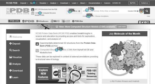
Heuristic evaluation to assess current usability issues that were apparent without subject matter expertise on proteins
User interviews with 4 PDB users, 3 of whom were provided by the client and 1 sourced through personal connections
Contextual inquiry, specifically asking users to show us how they used PDB, why they chose certain actions and to think aloud with us on what they loved or struggled with along the way
Think aloud interviews with 5 professors provided by PDB to see how they used the tool with their classes, labs, and research
First click testing with 37 participants sourced by the UX team to ensure a wide variety of participants
Learnings:
Users didn’t care about the detailed summary pages at all! Most users treated the PDB website like a search engine. They went directly to the search bar and were often annoyed with how clunky the advanced search features were
On detailed protein pages, users were often so familiar with the layout that they glossed over the sections they didn’t need to focus quickly on the sections relevant to their roles
Users loved the tutorials, but struggled to find them and many didn’t know about educational features like PDB-101
Nearly everyone we talked to would simply go to another tool or website if they couldn’t quickly find the information on PDB
Non-expert users often found PDB overwhelming and intimidating
Redesign
While the client said they were most interested in refining the detailed summary pages, we shared the user feedback we had gathered and recommended exploring ways to optimize the PDB home page, facilitate searching, and highlight instructional information. Our redesign would prioritize:
Highlighting the search bar
Improving the simple and advanced search experiences
Condense information on the detail summary pages
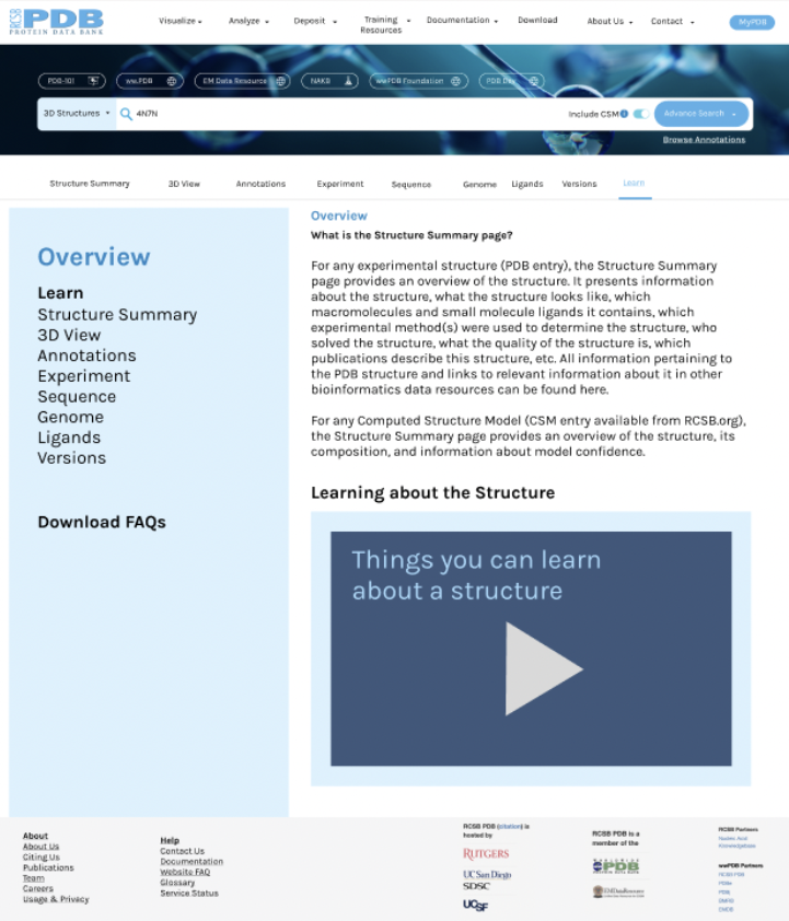
Adding a new “Learn” tab in detail summary pages with educational information
Creating more clear and consistent labeling and adding tooltips, hints, and links to aid users
Making it easier to figure out how to get help using PDB
We started with rapid paper and pen prototyping, working as a team to build a hybrid of all the best ideas.
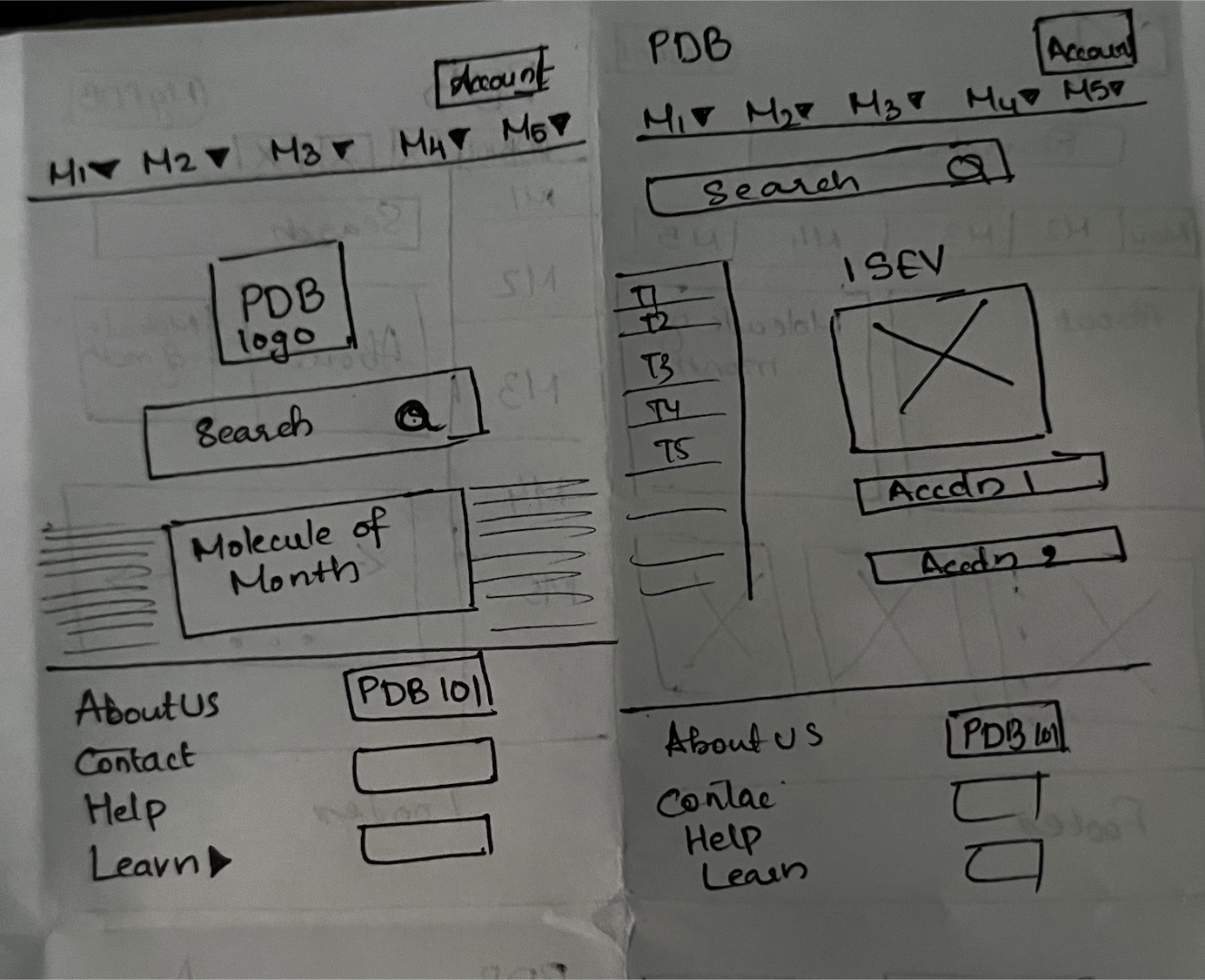
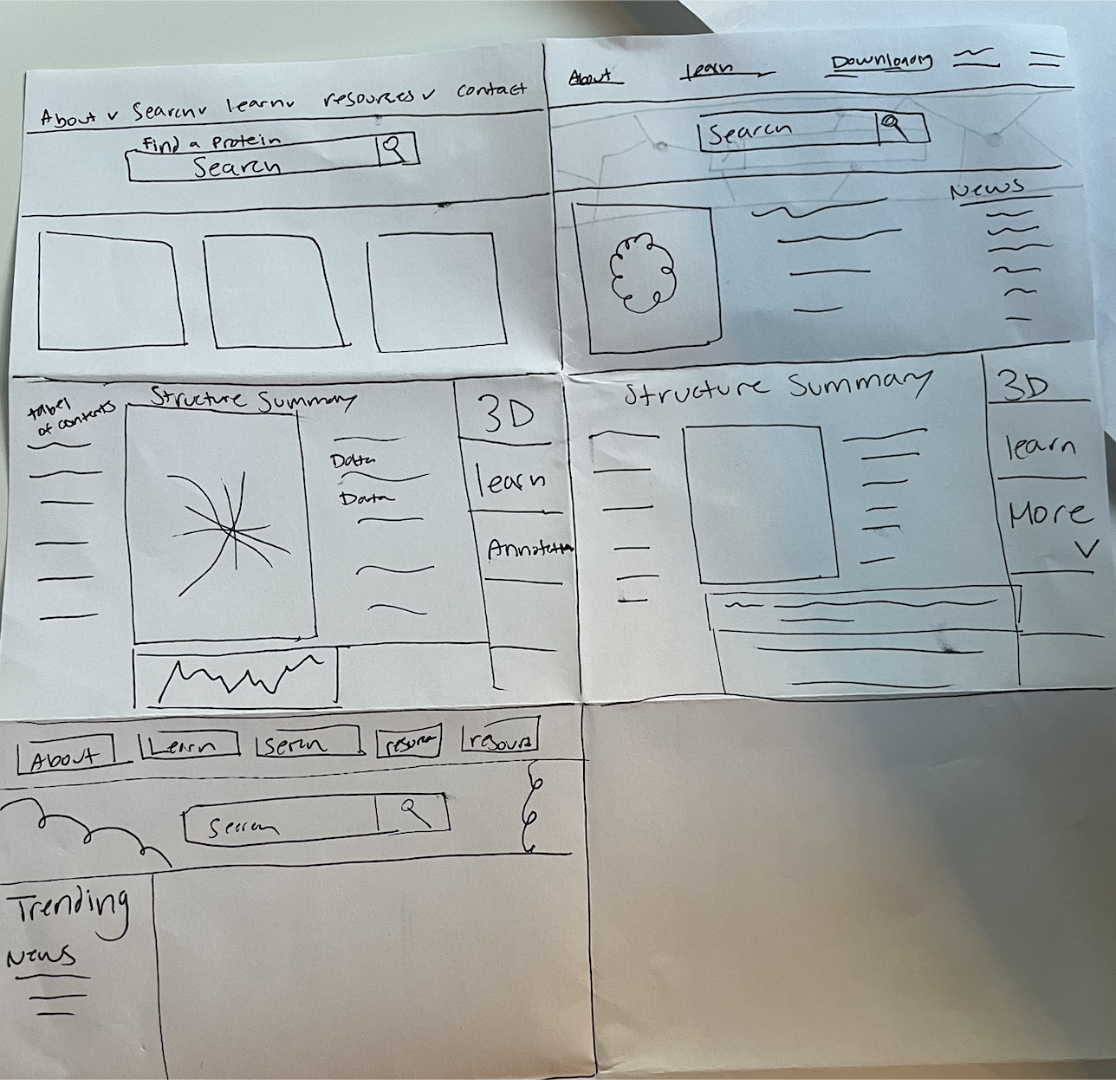
Once we cemented our ideas, we moved into Figma prototyping. We removed the redundant side navigation and made the search bar more prominent.
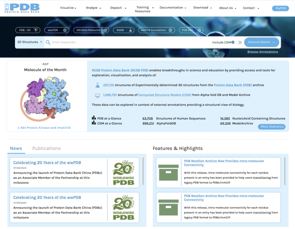
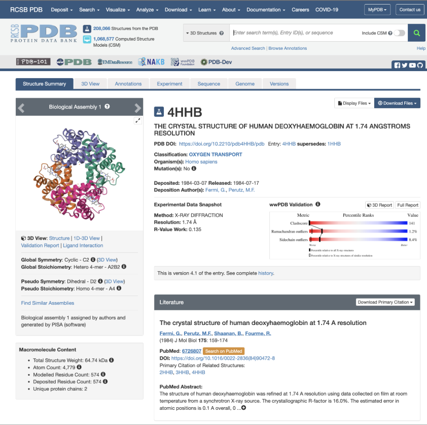
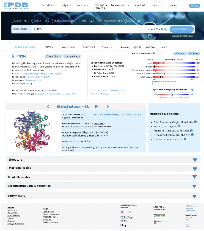
We also condensed the detailed summary page, collapsing sections into accordion menus to make it faster to find the sections users need and to avoid the overwhelm of sections they ignore or skim. We added a new Learn tab to the navigation submenu on the detailed summary page. The Learn tab would house the educational information users previously needed to search to locate.
User Testing
Next, we tested the prototype with 5 users, including 1 student who had never seen PDB before and asked them to complete common tasks, like downloading files, navigating the 3D view, finding documentation, seeking help, etc. We learned:
The navigation link names would benefit from further refining because they still caused some confusion (for example “Resources” was too broad, but “Learn” and “Documentation” weren’t clear enough)
Users had a lot of individual ideas for improvement, but little overlap, suggesting testing with more users and trying to refine by segment might give more conclusive results
Users really liked the larger search bar on the home page and the accordion dropdowns on the detailed summary pages
Users felt the Learn tab would be especially useful for students
Final Thoughts
This project was a learning experience in communicating to stakeholders the need to reevaluate goals - in this case due to a mismatch between where they thought their user experience needed to be improved and where the users actually needed assistance. We had to carefully and compassionately convey honest feedback from users and think through PDB’s organizational needs to successfully show them why we made our recommendations and push development in the appropriate direction.
With more time and resources, we would expand testing to see how different types of users might have varying needs. We spoke with students, professors, lab assistants, pharmacology fellows, structural chemists, and more and barely scratched the surface on the types of people using PDB as a resource.
It also would have been helpful to engage with some subject matter experts outside the scope of user interviews to do a more in depth competitive analysis. Other tools, like Uniprot, were mentioned in user interviews as alternatives to PDB and could shed light on where PDB could adapt to keep users in their content. While a knowledge of UX best practices still allowed us to make helpful changes, knowing more about the STEM side of things could have helped us design even more impactful changes.