
Accessibility is vital.
Technical documentation is dense.
Organizations set themselves up for failure by ignoring accessibility, but people are often unsure where to begin.
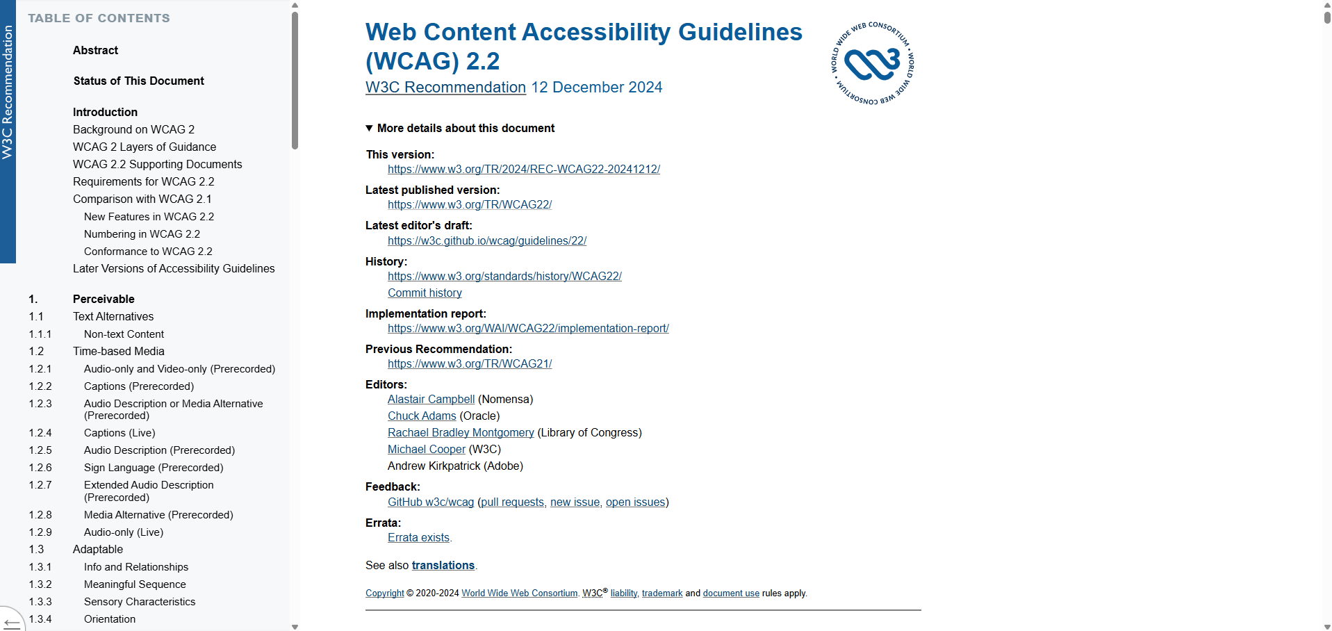
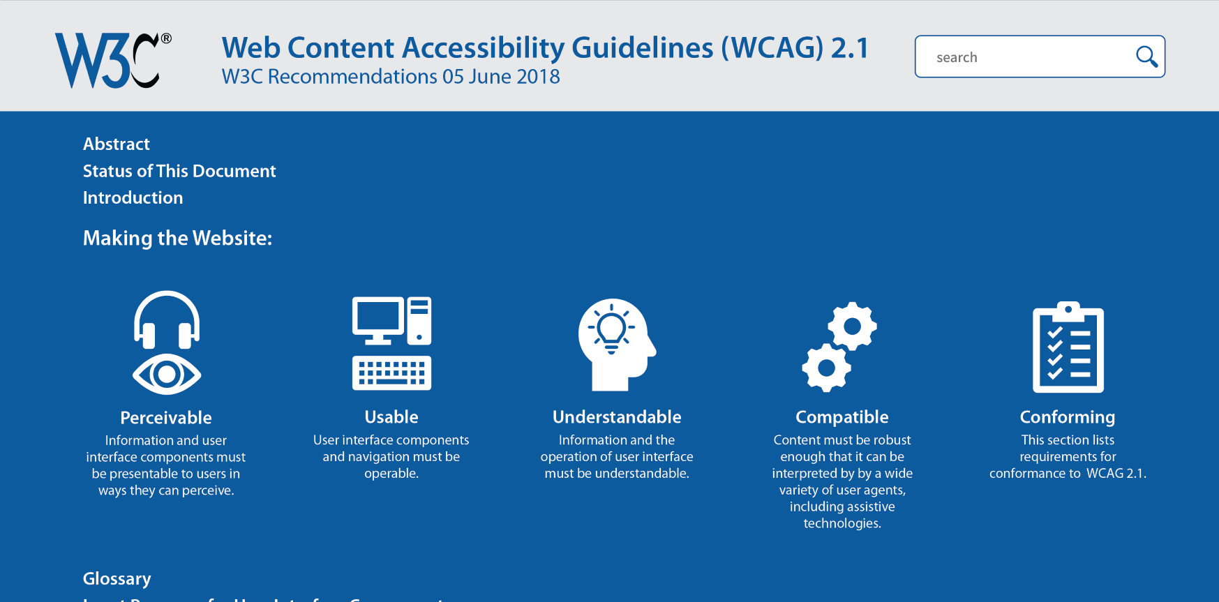
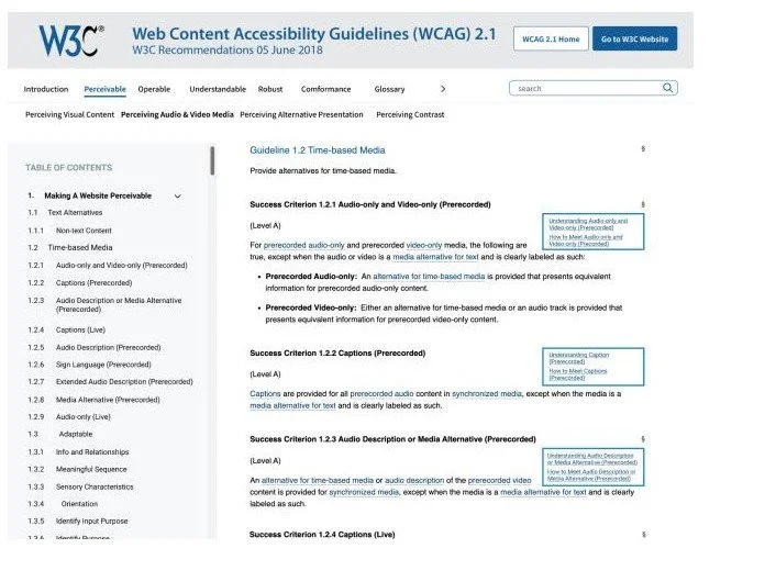
The Web Content Accessibility Guidelines (WCAG) are the international gold standard of technical documentation for accessibility. It’s a giant document, over 100 pages long when printed.
Overview
Basics
3 UX researchers
15 weeks
My primary role:
Recruitment of participants
Development of research tasks
Specialist knowledge of the accessibility space
Analysis of test results
Methods
Development of user personas
Competitive analysis of other accessibility guides
First click testing
Tree testing
Navigation stress testing
Heuristic evaluation
Card sorting
Problem
How can we make dense and challenging technical documentation easy to navigate and easy to learn for non-specialists?
Discovery
We recreated the existing website’s site map and wireframe and conducted several tests in Optimal Workshop to help us get a better sense of the issues at hand.
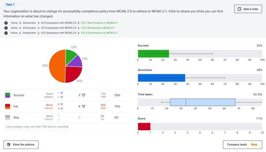
First click testing (10 participants) - We wanted to check how users were engaging with the visual hierarchy and existing information architecture on the page. Users struggled with basic navigation and time required to complete tasks expanded as participants were asked to look into more specialized sections of WCAG.
Tree testing (9 participants) - Because WCAG has a flat site map with little hierarchy and lots of links, we used tree testing to see if participants could quickly navigate through an extensive table of contents style link list to find information. Users often needed to click around and took about half a minute to navigate through the existing tree.
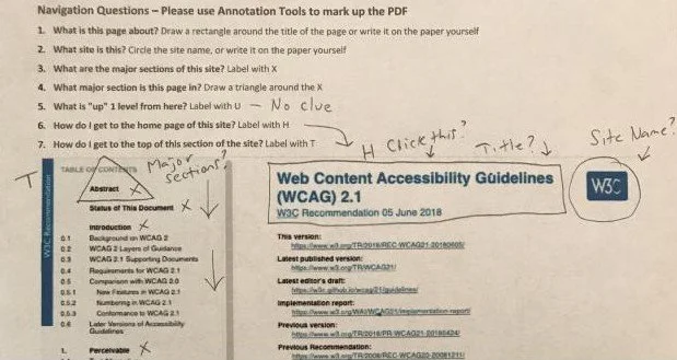
Navigation stress testing (4 participants) - To mimic bottom up search functions and how participants might engage with content without the context of drilling down through the site, we asked them to mark up a series of items with notation tools in a PDF or with just a pen and printed sheet of paper. Rapid low level testing and prototyping can help us identify what’s working or not to steer design choices. Participants communicated that the side nav was effective, but it wasn’t always clear what elements were interactive visually and that both clearer messaging and reducing the density of the content on the page would make the page easier to use.
Learning: While the existing site structure is usable, users would benefit from something with clearer navigation, less content per screen, and plainer language.
Refining ideas
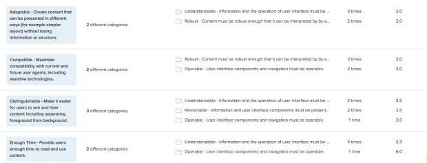
Based on the general agreement from participants that navigation could be improved, we wanted to begin the redesign process with a card sort to see how users might arrange this information in a way that makes sense to them. We gave the users categories named for the existing principles that organize WCAG, POUR (Perceivable, Operable, Understandable, Robust), with the option to create their own categories and asked them to sort the 13 guidelines into categories.
No users created custom categories - with additional time, it would have been nice to restest this with no categories given and see if the results were different
Most cards were added to at least 2 categories and there was little agreement
Operable received the highest level of agreement, 53% between all 5 participants
Learning: Users think the existing categories make sense, but can’t agree on what they mean. Perhaps the next step is to refine how the categories are labeled.
We suspected part of the problem with WCAG’s existing navigation might be the numbers and the dense language, so we re-wrote the existing headings without numbers and with more understandable language and repeated our tree test tasks from the discovery stage with new participants. The overall effect was underwhelming and users performed comparably to the initial tests, suggesting that changing the labels wasn’t effective.
Learning: The labels may not be the biggest problem with site navigation and usability.
Redesign
We turned to visual redesign next. In Figma, we redesigned the site to simplify existing navigation with a conventional top navigation instead of a table of contents style side bar. We also added more color and thicker lines to draw attention to interactive elements that users seemed to overlook. You can see the Figma prototype here. We repeated the tasks from our initial first click testing in discovery and found some success. Overall time required for tasks dropped by about one minute and 16 seconds, suggesting users were finding information more easily.
Final Thoughts
This project revealed that there are some struggles with the existing WCAG site structure, but fixing them could be complicated or require significant time. Some mistakes in our testing methodologies (like suggested categories in our card sorting test) may have pushed our redesign into the wrong direction and limited our ability to innovate on the existing site map. However, we did uncover some very minor tweaks to visual design that significantly improved user performance and suggested that there are still lots of ways that WCAG could be made more intuitive and easier to use.
With additional time, we would have expanded on our testing and refined ideas that underperformed. However, sometimes the best design choice is to leave something alone and put our efforts into higher impact changes.